| Author |
Message |
|
Gryphon
Has a life
Joined: Fri Apr 24, 2009 9:31 pm
Posts: 38

|
Dunno what happened to this post  I wrote: Very Nice, much prefer it to my attempts  Someone else edited my post and wrote: I like that one too. (NB. Sorry I somehow edited this post rather than quote it. Sorrt about that, Lev) _________________ 
Last edited by Gryphon on Sun Apr 26, 2009 10:30 pm, edited 1 time in total.
|
| Sun Apr 26, 2009 9:40 pm |

|
|
|
l3v1ck
What's a life?
Joined: Fri Apr 24, 2009 10:21 am
Posts: 12700
Location: The Right Side of the Pennines (metaphorically & geographically)
|
|
| Sun Apr 26, 2009 9:47 pm |

|
|
|
l3v1ck
What's a life?
Joined: Fri Apr 24, 2009 10:21 am
Posts: 12700
Location: The Right Side of the Pennines (metaphorically & geographically)
|
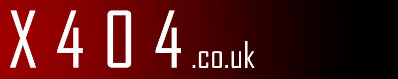
I like it except it's hard to see some of the x404 text
|
| Sun Apr 26, 2009 9:48 pm |
|
|
|
mars-bar-man
Doesn't have much of a life
Joined: Fri Apr 24, 2009 4:00 pm
Posts: 940
Location: Pompy
|
That is really good man!! Love it!! _________________Just your friendly neighbourhood mars-bar-man.flickr
|
| Sun Apr 26, 2009 10:19 pm |
|
|
|
Gryphon
Has a life
Joined: Fri Apr 24, 2009 9:31 pm
Posts: 38
|
just want to point out that the logo above isnt mine as the quote sugests... the posts got messed up somehow. Its supposed to be steve74 - he made it. (although i'm happy to take the credit  ) _________________
|
| Sun Apr 26, 2009 10:33 pm |
|
|
|
mars-bar-man
Doesn't have much of a life
Joined: Fri Apr 24, 2009 4:00 pm
Posts: 940
Location: Pompy
|
Lol, still looks awesome, I think that would be a pretty decent logo to have for the forums.
Btw, when does the voting commence?
_________________Just your friendly neighbourhood mars-bar-man.flickr
|
| Sun Apr 26, 2009 10:37 pm |
|
|
|
Angelic
Doesn't have much of a life
Joined: Thu Apr 23, 2009 7:16 pm
Posts: 704
Location: Leeds, UK
|
 Here's my take on the logo front. It's simple, but I figured that'd help scaling in the long run (Can be extended easily by adding a black bar to the right of it).
|
| Mon Apr 27, 2009 1:31 am |
|
|
|
veato
I haven't seen my friends in so long
Joined: Fri Apr 24, 2009 7:17 am
Posts: 5550
Location: Nottingham
|
I think this is the first one to have someone say they dont like it. _________________Twitter Blogflickr
|
| Mon Apr 27, 2009 6:10 am |
|
|
|
Pente
Has a life
Joined: Mon Apr 27, 2009 6:37 am
Posts: 1
|
|
| Mon Apr 27, 2009 6:38 am |
|
|
|
l3v1ck
What's a life?
Joined: Fri Apr 24, 2009 10:21 am
Posts: 12700
Location: The Right Side of the Pennines (metaphorically & geographically)
|
This is the second. I don't like that one either.
|
| Mon Apr 27, 2009 6:55 am |
|
|
|
pg2114
Doesn't have much of a life
Joined: Sat Apr 25, 2009 9:17 pm
Posts: 741
|
Sorry, but I'm not too keen on that  Peter. _________________A Mac user 
|
| Mon Apr 27, 2009 7:02 am |
|
|
|
KRKux
Occasionally has a life
Joined: Thu Apr 23, 2009 6:50 pm
Posts: 278
Location: London / Bedfordshire / Newcastle
|
Lol word ^^
_________________I had the last spam thread in the TMP.
|
| Mon Apr 27, 2009 8:06 am |
|
|
|
l3v1ck
What's a life?
Joined: Fri Apr 24, 2009 10:21 am
Posts: 12700
Location: The Right Side of the Pennines (metaphorically & geographically)
|
So far my preferences are: 1st (now the 404 text is a good colour.)  I like the way it looks and the fact is refers to the three most common mags the people from the meeting place read. 2nd  Looks very cool, though no reference to where x404 came from. 3rd  Looks cool, though no reference to where x404 came from. NB. I'll edit this post to show my favourites as the entries come in.
|
| Mon Apr 27, 2009 8:35 am |
|
|
|
saspro
Site Admin
Joined: Thu Apr 23, 2009 5:53 pm
Posts: 8603
Location: location, location
|
Once the comp finishes and one of the team start the poll, providing we have enough choice (there are some very good ones so far)
|
| Mon Apr 27, 2009 8:46 am |
|
|
|
HeatherKay
Moderator
Joined: Thu Apr 23, 2009 6:13 pm
Posts: 7262
Location: Here, but not all there.
|
I haven't got involved in the competition, even though I do this sort of stuff for a living. I thought it better to let everyone else have a go, as I'd have an unfair advantage, as it were. Anyway, can I make small plea to the protodesigners out there to not make the logo look quite so, well, PC-ish? We're still a mixed bunch here, and if we want to attract Mac users as well as PC and Linux folk, then it ought not to include elements from any one particular OS. If that makes sense. Oh, and Word Art is definitely a no-no.  _________________My Flickr | Snaptophobic BloggageHeather Kay: modelling details that matter. "Let my windows be open to receive new ideas but let me also be strong enough not to be blown away by them." - Mahatma Gandhi.
|
| Mon Apr 27, 2009 8:52 am |
|
|


